Pick up a premium skincare brand's lookbook and compare it to a drugstore brand's website. The difference is immediately apparent — but hard to articulate. The premium brand's images feel expensive, editorial, considered. The drugstore brand's images feel transactional.
This difference is created by a handful of specific, learnable techniques. None of them require a large budget. All of them require intention.
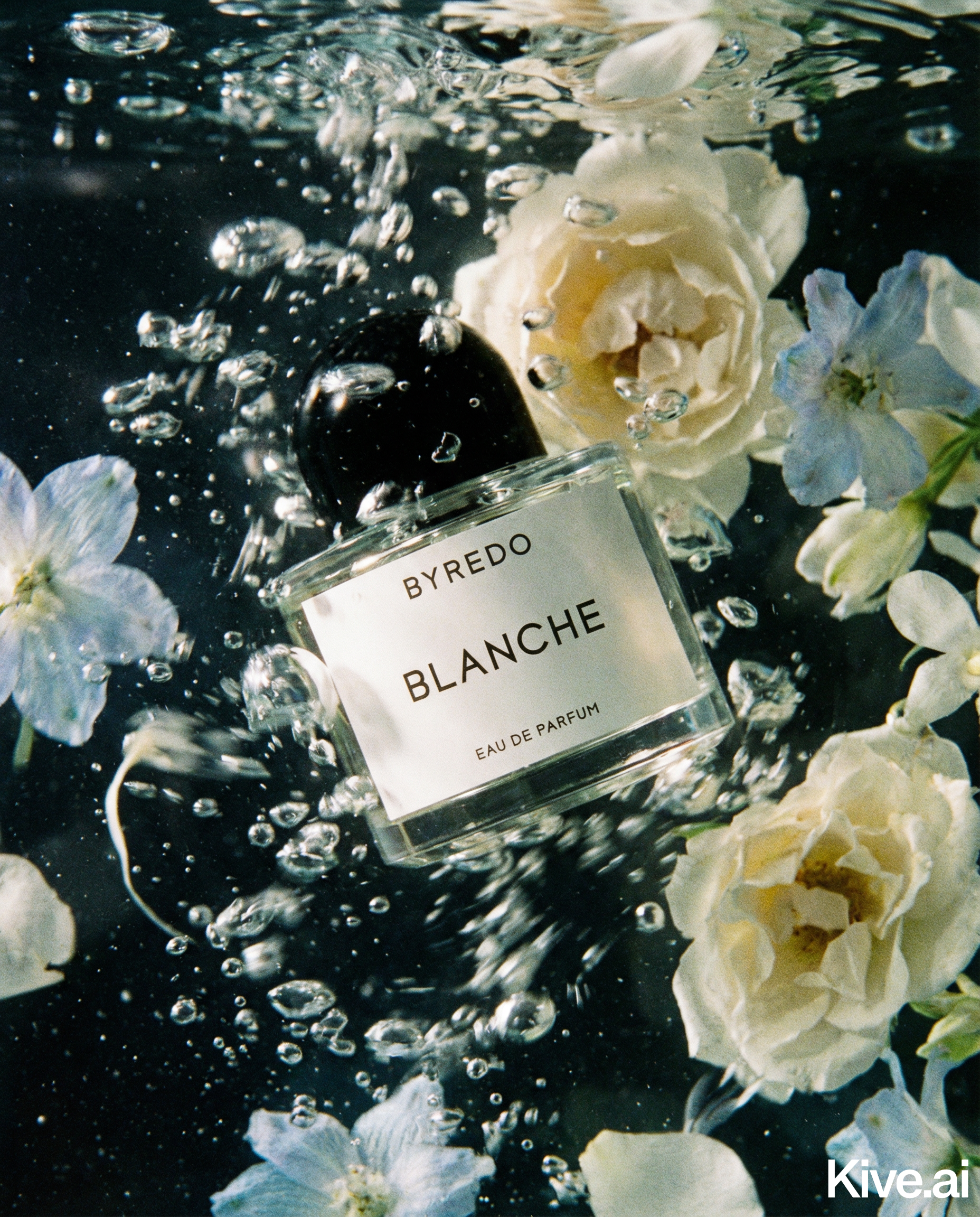
The surface you place your products on is the single highest-impact variable in luxury skincare photography. The surface occupies as much frame space as the product — sometimes more — and its material quality is experienced subconsciously by the viewer.
High-end surface choices:
- Marble: The classic luxury surface. White Calacatta marble with subtle grey veining is the gold standard. Even a small marble tile ($10–$30 from a tile supplier) works.
- Travertine: Warm, organic, slightly rougher than marble. Works beautifully for natural and botanical-positioned skincare.
- Brushed brass or copper trays: Adds a warm metallic note that elevates clinical packaging.
- Polished concrete: For brands positioned as modern and architectural.
- Aged stone: Rough-textured slate or limestone for brands with a provenance narrative.
Surfaces to avoid at premium price points:
- Plain white foam board (looks DIY)
- Wood grain laminate (looks domestic)
- Coloured fabric backgrounds (distracting)
The surface isn't just a background — it's context that tells the buyer about the product's world. Marble tells them this product belongs in a Parisian apartment bathroom. Concrete tells them it belongs in a contemporary architect's home.
Luxury skincare lighting is controlled, directional, and reveals material quality.
Side lighting: Position your main light source at 90 degrees to the product — illuminating it from the side rather than from in front. This creates: - Gradients of light and shadow that reveal the three-dimensionality of packaging - Metallic gleam along the edges of aluminium caps and glass bottoms - Subtle reflections in the surface material beneath the product
Sellable's platform turns a single product photo into studio-quality images, cinematic video, and on-brand campaigns — generated, refined on the canvas, and published straight to your store.
Negative space is intentional emptiness. In luxury photography, the product doesn't fill the frame — it commands the frame. Generous space around the product creates a sense of confidence ("we don't need to cram everything in") and luxury ("space is a premium we can afford").
A common luxury composition rule: the product occupies 30–50% of the frame. The remainder is background. This creates breathing room and draws the eye naturally to the product.
The colours visible in a product image communicate positioning before the buyer reads a word. Premium skincare colour palettes:
Keep your surface, props, and background consistent with your target palette. A pink brand shooting on a terracotta surface creates colour dissonance that undermines positioning.
AI photography generates luxury skincare imagery from a simple product shot, applying all the above principles programmatically:
For skincare brands launching multiple SKUs, Sellable's style presets lock in the luxury treatment so every new product generates images that belong to the same premium visual world.
Sign up for free and transform your product photography with Sellable.
Get started for free